Si të përgatisni saktë një dizajn për printim
Një nga gabimet më të shpeshta në dizajnin grafik është përgatitja e gabuar për printim. Një dizajn mund të duket perfekt në ekran, por të dalë krejt ndryshe në shtyp nëse rregullat teknike neglizhohen.
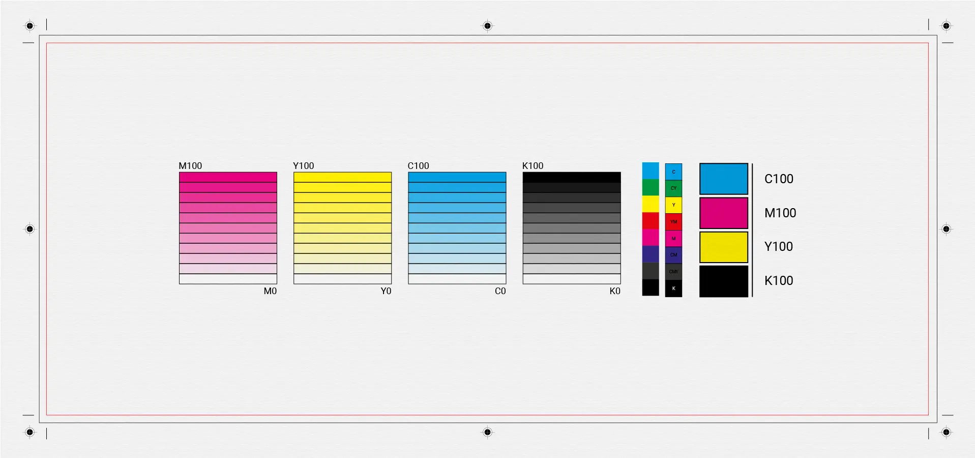
1. RGB vs CMYK – what you need to know
Ekranet përdorin RGB, ndërsa printimi përdor CMYK.
Nëse skedari nuk konvertohet siç duhet:
- ngjyrat duken më të errëta
- tonet ndryshojnë
- humbet saktësia vizuale
📌 Gjithmonë përgatitni skedarët finalë për printim në CMYK.
2. Rezolucioni i saktë
Rezolucioni ideal për printim është:
- 300 DPI për imazhe
- vector formats for logos and illustrations
Imazhet me rezolucion të ulët rezultojnë në printime të paqarta.
3. Bleed, trim & safe area
Një skedar korrekt për printim përfshin:
- Bleed (3–5 mm) për prerje të pastra
- Vijën e prerjes (trim line)
- Safe area për tekstin dhe elementët e rëndësishëm
Pa këto, gabimet gjatë prerjes janë shumë të mundshme.
4. Fontet dhe teksti
- Shmangni fontet shumë të holla
- Konvertoni fontet në outline
- Shmangni madhësitë shumë të vogla të tekstit
Kjo parandalon probleme gjatë prodhimit.
5. Kontrolli final
Para printimit:
- kontrolloni ngjyrat
- rilexoni tekstin
- bëni një print testues nëse është e mundur
👉 Nëse keni nevojë për dizajn profesional të përgatitur për printim, feel free to contact me.