
How to properly prepare a design for print
One of the most common mistakes in graphic design is incorrect print preparation. A design may look perfect on screen but appear completely different when printed if technical rules are ignored.
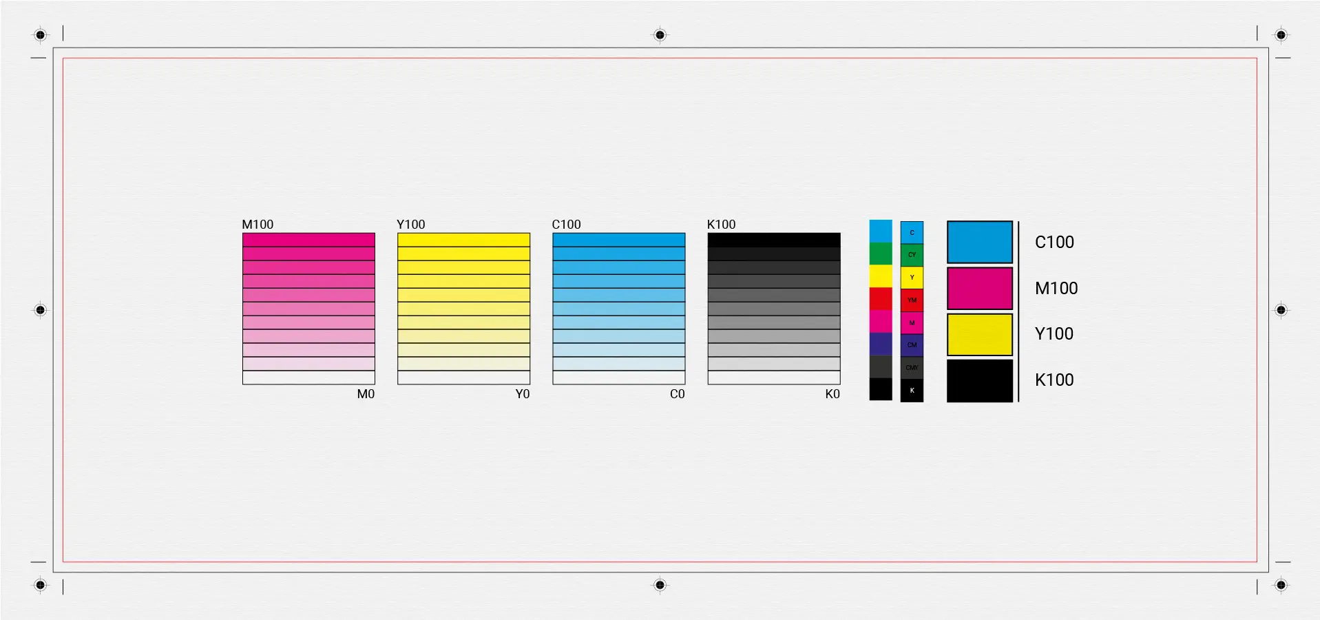
1. RGB vs CMYK – what you need to know
Screens use RGB, while printing uses CMYK.
If the file isn’t converted correctly:
- colors appear darker
- tones shift
- visual accuracy is lost
📌 Always prepare final print files in CMYK.
2. Correct resolution
The ideal print resolution is:
- 300 DPI for images
- vector formats for logos and illustrations
Low-resolution images result in blurry prints.
3. Bleed, trim & safe area
A proper print file includes:
- Bleed (3–5 mm) for clean trimming
- Trim line
- Safe area for text and important elements
Without these, cutting errors are likely.
4. Fonts and text
- Avoid ultra-thin fonts
- Convert fonts to outlines
- Avoid very small text sizes
This prevents production issues.
5. Final check
Before printing:
- check colors
- proofread text
- run a test print if possible